As a company, having a comprehensive view of your entire business is critical to your ongoing success. Knowing which aspects are performing well and which aspects are facing challenges allows management to redirect attention and resources as necessary to meet objectives. This is just as true for nonprofit organizations as it is for companies that make a profit. Collecting and presenting that information, however, is often a major challenge, as it often resides in different systems, each of which often have different reporting capabilities, and significant amounts of staff time are spent compiling and massaging data for presentation to senior management and other interested parties.
Over the past 20 years, data warehouses, and the business intelligence tools that sit on top of them have often been touted as the solution to the problems detailed above. The technology setup required to create and maintain these solutions, however, is expensive and complicated, and usually needs substantial skills and dedicated staff to manage it. In the last few years, a new set of technologies have appeared, providing ‘Cloud-based Business Intelligence’ solutions that, while they don’t eliminate the challenges of setting up and managing these tools, do make them a lot more accessible to companies that might not have been able to approach them in the past. The Salesforce Analytics Cloud (aka Wave) is a strong contender for organizations that are already using Salesforce for some aspect of running their business.
Wave allows organizations to predefine dashboards and reports (called Lenses) based on data contained within Salesforce and imported from other systems, but its real power is that those tools aren’t static; users can drill into the data in different ways in order to answer different questions about how their business is performing.
- A Development Director could use Wave to review her national fundraising performance against plan and then drill down to see which regions are over or under-performing, and where. By comparing historical data, she could then look to see if there are seasonal factors in play, or if there are other gap-closing initiatives that could be started to mitigate areas with challenges.
- A Program Manager could look at program outcomes and examine the underlying data to understand differential outcomes by gender or ethnicity. Using those insights, she could devise strategies to address any areas of concern.
- A Marketing Director could analyze message performance (open rates, lead conversion, etc.) by recipient demographics and gain better insight about what’s working or not.
For nonprofit organizations, in particular, that can figure out how to use it, the product has great potential. It is, however, a bit intimidating to approach. In order to help make the product a bit easier to approach, I’ve spent the last several weeks building out a sample data set and some dashboards, based on the Nonprofit Starter Pack and Volunteers for Salesforce. We’ll be able to use these tools to show nonprofits how they might be able to leverage the power of the platform. Our hope is that by showcasing realistic data that will make sense to nonprofit professionals, we can lower the barrier of entry to using the product and allow them to better envision how it can help them solve key organizational problems.
Catching that First Wave – An Example!
For many nonprofits, keeping the number of donors who gave last year, but haven’t given yet this year (LYBUNT) low is a key measure of success. The roll-ups in the Nonprofit Starter Pack (NPSP) do a great job of keeping track of this by tracking the amount and number of donations both in the prior year, as well as the current year, and it would be easy enough to run a simple report that provides that information. In fact, the NPSP comes with a standard LYBUNT report that you can work with right “out of the box.”

What that report may not provide, however, is insight about the different dimensions of the data – for example, what is the gender breakdown or age variance or geographic distribution of those donors who you want to target? It’s possible to get a report with that information, and to add a chart to the report, but each time you want to look at that data again, you’ve got to save a different copy of the report.
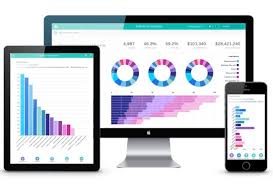
With Wave, changing the dimension for analysis and seeing the results graphically takes only a few clicks, allowing the user to focus in on the most important data on which to take action.
![]()
Looking at this calendar heat map (using the same data set as produced the standard report above), I can see that my two heaviest giving months are January and July, so I might choose to look at just the donors whose last giving date was in the first half of the year. I can quickly add a filter to look only at that set and then group them by different dimensions until I see something that jumps out at me.

When I look at the data by region, I can see that I have higher numbers of lapsed donors in my eastern region. It might be worth a discussion with the my staff in that region to find out what’s going on and see if there’s anything we can do to get those donors to come back to us.
And the great thing is – I can do this not just on a laptop back in the office, but also on an Android phone or iPad, using the Salesforce Analytics app!
Hang 10 – Going Beyond the Basics!
Once you’re ready to start sharing the data insights across the organization, you can add your visualizations to standard page layouts, custom Visualforce pages and even Salesforce Communities pages. For your users actively viewing Wave Dashboards and Lenses, you can set up action menus that allow them to directly open underlying data in Salesforce, post snapshots to Chatter or even log tasks associated with records.
Cowabunga – Integrating the Analytics Cloud Across the Organization!
As most organizations have found with using Salesforce, once you get started with it in one area of your business, it becomes easier to use it in other areas over time. As an organization grows with Salesforce, it often needs to make choices about consolidating systems on the platform, or at the very least, being able to compare data from different systems in one place. This is where the Analytics Cloud can really show its value to an organization.
The data integration and import features of the product provide a way to get data from disparate data sources into the platform, but without actually having to build out a data architecture in Salesforce to store it. Once you’ve got the data into Wave, the same tools that are used on your Salesforce data can be used to report and analyze the new data. You can even build dashboards that show the data from those different data sources side by side, or when you’re really ready to go, build data sets that blend data from your different systems.
Integration can range from uploading data from CSV files, to using the Wave Connector for Excel, to using complex tools like Informatica, and will generally require some proficiency with databases, JSON and data integration tools. Do not fear, it is doable, even for organizations that don’t have large IT departments.
Wrapping It Up
As the amount of data that organizations store proliferates, implementing tools that allow users to quickly get to the information that they need and to act on it becomes a true differentiator. Using the Analytics Cloud can help you do this, particularly if you take it one step at a time.
If you want to actually play around with the Wave Product, try downloading the Salesforce Analytics app from the App Store for your mobile device (it comes with a sample data set). It will give you a good sense of the types of visualization you can do with the product. Alternatively (or in addition), do the “Explore with Wave Analytics” trail on Trailhead.
Cloud for Good has developed a Wave Quickstart program, designed to get an organization using the Nonprofit Starter Pack and/or Volunteers with Salesforce up and running quickly on the Analytics Cloud using a set of predefined Lenses and Dashboards. We are also happy to discuss more sophisticated Analytics engagements to meet your specific needs.
You may also be interested in reading:
Salesforce Analytics for Nonprofits eBook
4 Steps to Become Salesforce Analytics Cloud Ready